
In the summer of 2020, I decided it was time to collect some data from my garden. I did this for two reasons:
- I was curious about how much food I produced.
- I wanted to use the data in my Introductory Data Science course at Macalester College.
I knew the data would be fairly simple, and I liked that it would be a bit personal and give a way for me to connect with students. Although I didn’t know it when I started collecting the data, the personal aspect ended up being especially important during the 2020-21 school year when I was teaching remotely.
Introduction
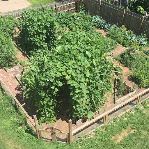
I started vegetable gardening in 2004 and have been hooked ever since. My first garden spanned approximately 30 square feet, a 2 foot by 15 foot parcel. Each summer, I dedicated more and more space to the vegetable garden, removing grass and adding raised beds, eventually taking over most of the back yard. In 2017, I moved to a house with a much bigger yard where I could have a nearly 50 foot by 50 foot dedicated garden space—not bad for a city garden! I won’t bore you with all the details of how it all came together, but by the summer of 2020, it was in good form! I’m most proud of digging the fence post-holes (with a manual post-hole digger!) and laying nearly every single one of those bricks, by hand. Big thanks to my husband Chris for making the garden boxes and the fence. Perhaps this photo allows you to see why I refer to my garden as the “Jungle Garden”.
In the summer of 2020, I decided it was time to collect some data from my garden. I did this for two reasons:
- I was curious about how much food I produced.
- I wanted to use the data in my Introductory Data Science course at Macalester College.
I knew the data would be fairly simple, and I liked that it would be a bit personal and give a way for me to connect with students. Although I didn’t know it when I started collecting the data, the personal aspect ended up being especially important during the 2020-21 school year when I was teaching remotely.
Collecting the Data
Before I could share the data with my students, I had to collect the data. This was both an awful and great experience. After being the end-user of data for nearly twenty years, it gave me a great deal of appreciation for people who collect it. I think anyone who analyzes data should have a go at collecting their own data, at least once (I’m trying to figure out how to make this part of my class, too). Even in this very small endeavor, I learned a lot.
I took some time thinking about the data I might want to analyze and tried my best to set up spreadsheets to collect everything I thought I would need. In the end, I made four Google Sheets, which are discussed and linked to below. There were a few mistakes I made, like spelling things differently (capitalization, mostly) across the different spreadsheets.
- Spending data on how much I spent on seeds, plants, etc. for the garden.
- Planting dates data on when, where, and how much of each seed/plant was planted.
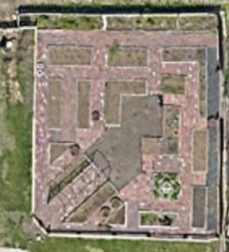
- Plot coordinates data on grid coordinates to identify the various plots in the garden (see photo below).
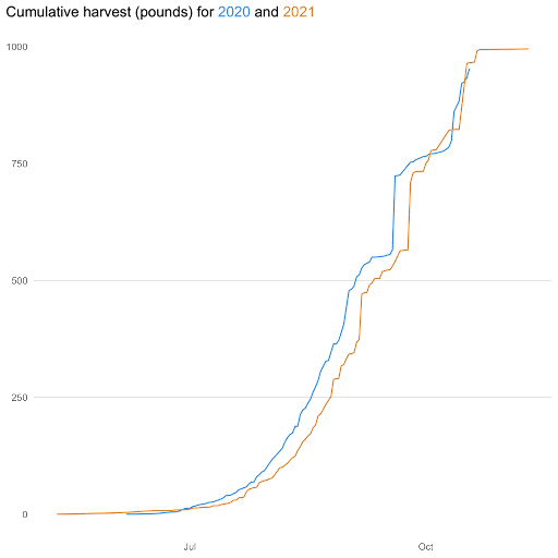
- Harvest data on how much of each vegetable variety was harvested. Each row is a “harvest” of a particular vegetable variety. So, each time I harvested a particular vegetable/variety combination, I weighed the entire harvest. There could be multiple harvests of a vegetable/variety combination in a single day. There are two exceptions: all pumpkin and winter squash (vegetable = “squash”) we re-weighed individually. This is the main dataset used for analyses.
Putting the data in Google Sheets made it easy to read the data into R using the googlesheets4 package by Jenny Bryan (see the help files here). My students and I read the data in that way until I finished collecting the data for the year and put it all in an R package called gardenR. You can read more about that package, including how you can install and use it on its GitHub page.
Using the data!
The best part about collecting the data was using it! And I was amazed at how many topics I could teach with it. I ended up using it to introduce almost every topic I taught, including:
- plotting with ggplot2,
- single-table data wrangling with dplyr,
- pivoting and joining with dplyr,
- factor modification with forcats,
- string manipulation with tidyr and stringr, and
- adding interactivity and animation with ggplotly and gganimate.
You can check out my full course website, https://ds112-lendway.netlify.app/, for detailed information about each of these topics. Or, for a more condensed version, download the talk_demo.Rmd file from my SDSS talk GitHub repo, or watch my presentation of it on YouTube.
The students also did a semester-long assignment called the “Perfect Garden Graph” assignment. The description of the assignment is below.
“Each week, you will submit a graph using my garden data. For this graph, you should ask a question of the data and then create a graph to answer that question. You will get feedback from me each week and will build on your previous graph. So, you don’t create a completely NEW graph each week, but rather continue to improve on the SAME graph over the entire course. This assignment will focus on the details of the graph that we don’t usually have time for in weekly assignments. It will also be about writing nice code and annotating it.”
They start with a blank RMarkdown file. In the first week, they submit a single graph. They copy and paste my feedback (which they find on Macalester’s learning management system (Moodle)) into the RMarkdown file before the next week, use that feedback to help improve their graph, and add that new graph to the file. I give them feedback five times, so in the end they have six graphs in the file and can see their improvements throughout. Iterating on one graph over the entire semester allows the students to focus on very detailed things about their graph, like color choices, title alignment, grid lines, tick mark placement, and more. At the end of the semester, we celebrate each other’s graphs with a showcase! You can find all the graphs online here (it takes a while to load the page since there are so many graphs).
Let’s do it again!
The first year using my own data went so well that I collected it again this past summer. I’m still harvesting the last of the vegetables for the year and will add the new datasets to the gardenR package before January. Having another year of data should allow for even more complex analysis. I’m excited to see what my data science students do for their graphs next spring when I teach the course again. Until then, I’m crossing my fingers that I have enough pumpkins and watermelon left to harvest that I can beat last year’s total and maybe even surpass 1000 pounds!

Contributing author Lisa Lendway has been teaching statistics and data science at Macalester College for the past 4 1/2 years. Before returning to Macalester College (she’s an alum!), Lisa worked as a statistician/data scientist in a variety of industries including retail, healthcare, and insurance. She strives to stay at the forefront of new R technology and to teach her students those skills so they can thrive in the workforce or graduate school. When not nerding out about R, you can probably find Lisa biking with her spouse, spending time with her 9 & 11 year old kids, or tending her large urban garden.

Leave a comment