
by Andy Zieffler
Editors Note: Andy took a great deal of care in the formatting of his post. Unfortunately, we were not able to publish it in a way that was truly faithful to the original. If you would like to see the post with all of the intended font choices and other intricate details, please see the pdf version.
Syllabi are as much a part of the higher education landscape as the buildings and faculty. Aside from their obvious function as a mechanism to impart information about the course to students, a syllabus also serves many other functions (e.g., Albers, 2003; Fink, 2012; Hutchings, 1996; Parkes & Harris, 2002; Thompson, 2007), including as evidence for decisions about course equivalency and for accreditation. The syllabus is often the first thing that students encounter in a course, and, if legions of professors are to be believed, the first thing they ignore.
The three words, “read the syllabus,” are baked into the college mythos, and not unlike Helen of Troy, have launched a thousand memes. One professor even hired Snoop Dogg (via Cameo) to exhort their students to “read the syllabus.” The answer to why students may “skip” the syllabus is multifaceted. Research suggests that students do read the syllabus. However, they may only focus on specific content, such as how they will be evaluated (e.g., Becker & Calhoon, 1999; Calhoon & Becker, 2008; Marcis & Carr, 2003). Other research has pointed toward students’ lack of awareness about the importance of the syllabus to their academic success—this may be especially true for first generation or international students (e.g., Collier & Morgan, 2008).
Even for students who understand how important syllabi are, it has been reported that until they need specific information, the syllabus is often a document that they rarely refer to (Calhoon & Becker, 2008). Moreover, even when they do consult the syllabus, the material they are seeking is difficult to find—it is often just easier to ask the instructor than find the needle they are seeking in the proverbial haystack of information, resources, and policies that are embedded in a typical syllabus.
Several scholars argue that the syllabus itself has utility as a teaching tool (e.g., Matejke & Kurke. 1994; Parkes & Harris, 2002). They suggest that in addition to serving as a contractual agreement between students and the instructor and succinctly communicating course expectations, the syllabus can also help students plan for how they can achieve course goals and function as a cognitive map for organizing and conceptualizing the course content. When thought of in this manner, it behooves us to consider how to get students to engage with the syllabus. One way, I would argue, to increase the probability of having students read your syllabus and retain the information therein (or at least be able to locate information when they need it) is to spend a small amount of time on the organizational structure and aesthetics of your syllabus.
Protip
If you are looking to completely revamp your syllabus, including the content therein, consider constructing a learner-centered syllabus (e.g., Cullen & Harris, 2009; Eberly et al., 2001) or adopting an equity-diversity-inclusion mindset to writing your syllabus (e.g., Fuentes, et al., 2020). You could also design a visual syllabus (why aren’t all visualization courses required to have a visual syllabus??) or write your syllabus as a comic.
Organizing and Sequencing the Content
When many of my peers begin teaching, they are either handed a pre-made syllabus (perhaps from a previous instructor) or are pointed toward a department or university template. While these may serve as good skeletons of the content that needs to be included, they are often not a great model for direct use. If my institution is taken as an example, the department template was based on a much older version of the syllabus and information has just been concatenated to this document by staff as new policies are enacted.
Take a minute to consider the organizational structure in your syllabus. Also consider the flow of that information from the beginning to the end of your syllabus. For example, is all the information related to grading and evaluation together? Or is it in different places? Where in the syllabus are things located and does that make sense?
There isn’t a single right way to organize information in a syllabus. Some instructors choose to put all course policies together, others choose to include each policy in the section where it is relevant (e.g., policies about make-up work are included with information about the assignments). The more important thing is that you as the instructor have made decisions about the sequence and organization of content that is useful for students.
I have tried it all over the years and for me this is the current sequencing I use:
- Welcome Message/Course Description
- Basic Course Information (e.g., location/textbook and materials)
- Course Calendar/Schedule
- Assignments and Grading
- Class Policies
- Instructor/TA information
- Mission Statements (required by our department)
- University Policies (required by our university)
Below is the rationale that I used in coming up with this sequencing. You can see online versions of my spring 2024 syllabi here (undergraduate) and here (graduate).
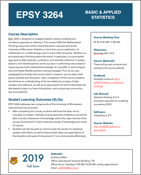
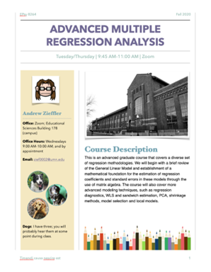
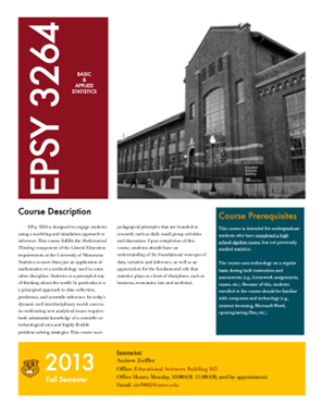
I wanted to set the tone immediately by welcoming students to the course. I also wanted to give them a broad overview (via the course description) about what they will be encountering. In considering the student point-of-view, I wanted basic course information easily accessible (location of the classroom, materials needed, etc.). As such, this is included on the landing page of the course website. I also wanted details about statistical computing and a “Note on Inclusion and Respect”, key aspects of the course, to appear early in the syllabus given their prominence.
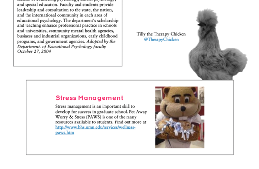
After this initial course information, I include the course schedule. This includes readings, topics, links to notes, and other materials for each day of the course. This is followed by “Assignments and Grading.” My thought was that information related to grading, including assignment descriptions, deadlines, expectations, and evaluation, made more sense after students had seen the schedule. I also include a note about “Stress Management” and an FAQ for the assignments. (Note that I separate assignments from the calendar, but I think they could also be included in the daily calendar!)
I have chosen to include all the class policies in a single place on the syllabus. These include policies on: Missing Class and Making up Missed/Late Work; ChatGPT and Other AI; Technology (more broadly); and our college policy on recording classes. While the policies are important, I don’t want to overwhelm students with them, so I try to limit how many I present. I also don’t want to include them until after more important class information has been acknowledged. Instructor and TA information, including office hours and contact information comes next. I also include a picture of the TA (with permission) and of myself. This helps students identify us. Lastly, I relegate other required parts of the syllabus that are not as germane to the class (e.g., mission statements, university policies) to the end of the syllabus.
Protip
One way to think about syllabus organization and sequencing is to ask your students about it. They are very thoughtful about how they and their peers interact with the syllabus and how it can be improved.
Aesthetics of the Syllabus
Once you have the organization and sequencing of the content, it is time to think about improving the aesthetic of your syllabus. “Does this really matter?” I hear some of you ask. If students aren’t reading my syllabus, why bother? Given that the syllabus is often the first thing that students experience in a course (even before meeting the professor), why not set the tone? First impressions matter! If an instructor cares enough to get the details right in their syllabus, it suggests they will take the same care in teaching the course.
Here is a list of aesthetic considerations that I believe can improve the look of any syllabus:
- Fonts
- Color Palette
- Graphics/Art
- Whitespace
Fonts
Choose a small set of fonts that look good together (and are readable). Be consistent about how you use them. Setting everything in Times New Roman (🥱) or Calibri (🤮) is, in my opinion, one way to have students never read your syllabus. Variation in font not only helps the aesthetic of your syllabus, but it also can help students navigate the information therein.
I typically use 3–4 fonts in my syllabi: one title font, one headings/subheading font, and one body font. (Sometimes I also have a boxed/pull-out text font.) If you adopt more than 3–4 fonts, the document begins to look ragtag, so be careful. If you have never thought about fonts before, here are some tips
- Most of the text in your syllabus will be the body font, so choose something readable. I prefer serif fonts for this, but a readable sans-serif font would also work. (Also note that this choice could vary depending on how students access your syllabus—sans-serif fonts are generally more readable on a screen while fonts with serifs are easier to read on paper.)
- Consider choosing fonts that increase accessibility for students. For example, the Atkinson Hyperlegible font is designed to be more accessible to people with low vision and the Dyslexie font is designed to improve accessibility for people with Dyslexia.
- Heading/subheading fonts can be fancier—while you might not want to read an entire syllabus set in Harry Potter Lumos, headings in this font might add a touch of whimsy.
Google fonts has many free fonts you can download and use (or use on your website). The site also has many articles discussing typography and font choice (e.g., differences between serif and sans-serif fonts).
Color Palette
Pick and utilize a consistent color palette for your syllabus. Although body text is probably best set in black (assuming the background of your syllabus is white), consider setting the headings/subheadings in a different color. What about having some text set in a box—things you want to call attention to such as class policies—and setting the background color of these boxes in some color? Maybe a bold color for your title? What color will you make web links?
I use coolors.co to choose color palettes. You can get inspiration from pre-generated palettes, or create your own palettes. One of the neat features is that you can lock in colors you like and then generate colors that pair well with your selected colors.
What looks good on the palette may not look as good when you try it on your syllabus. Some colors are difficult to read. Others just don’t “pop” as well when applied to text. Be prepared to try a few different combinations.
Lastly, be careful about choosing colors that people who are colorblind will have a hard time with. The coolors.co site will also allow you to visualize your palette under eight common types of colorblindness. I also encourage you to read through Okabe and Ito’s website on Color Universal Design for additional information about choosing colorblind-friendly palettes.
Protip
Font and color aren’t the only way to differentiate text. For example, I typically use the same font and color for my headings and subheadings, but I use a smaller font size for the sub-headings. You could also use different cases (e.g., small caps, uppercase) or alignment (left vs. centered).
Graphics/Art
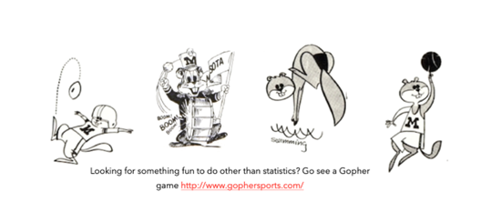
Not everything in your syllabus needs to be text. Adding images will break up the text and make the information in the syllabus easier to digest. (Think about children’s books!) Graphics are also a nice way to personalize your syllabus.
With the internet, you can find graphics quite easily. But be sure you have permission to use the graphics you choose; many are copyrighted. (Note: Even copyrighted images can be used under the Fair Use doctrine.) If you worry about copyright, you could search for images in the “public domain.” Images licensed under the Creative Commons license are also generally usable, but you may need to include a citation. I include an image attribution section in my syllabi. Several image sites allow you to search using these criteria (e.g., Flickr, The Noun Project). Your institution likely has an image repository of university-related images. Using vintage archival photos can be a nice conversation starter with students.
Protip
When choosing images, also consider your color palette. If the colors on the image clash with your palette, consider using an image processor to change the image to greyscale, black-and-white, or sepia-toned. There are several free tools that can do this (e.g., Paint, Preview, GIMP).
Whitespace
Text is easier for humans to read when whitespace is included. The most obvious whitespace in a text document is the margins. But line and paragraph spacing are also very important for readability.
While the default margins may be reasonable, play around with some different choices. For example, books often have asymmetric margins to account for the binding which also is nice if students are printing the syllabus and say, adding it to a 3-ring binder. This leaves room for notes and doodles.
Another potential place for whitespace is in the line spacing. Try a little bigger line spacing to see if the text you chose reads easier. Different fonts look better and are easier to read at different line spacing; experiment with this. A good place to start is to set your line spacing to 1.2 times the font size.
Also consider the space between paragraphs. This is typically set in the “before” and “after” values of your word-processing program. Again, this is a bit of trial-and-error to determine what looks good.

Summary
The suggestions herein are only suggestions, and like all suggestions, can be ignored. A syllabus reflects not only the course content, but also the instructor. Have fun! Choose fonts, images, and palettes that reflect your personality. This will take a bit of time (I spend several days per syllabus), but I find it is worth the effort.
Don’t feel you need a perfect syllabus. Like our courses, syllabi have imperfections, despite our best efforts. But, like our courses, a syllabus should get better with each iteration; some parts we like and keep in future versions, others we discard or change. Your syllabus will adapt and change as you grow and change as an instructor!
Protip
Ask yourself why you are still printing out the syllabus. Is it really a university requirement? After asking several folks, the only requirement we have is that students are provided access to a syllabus and that we share that with the department so they can keep it on file. I now only produce a website that acts as the syllabus (which is searchable) and use “Print to PDF” to give the department access.

Contributing author Andrew Zieffler is a Teaching Professor in the Quantitative Methods in Education program within the Department of Educational Psychology at the University of Minnesota. My scholarship addresses statistics education writ large, and has recently been focused on teacher education and also on how data science is transforming the statistics curriculum. You can find out more about some of this work at the LaSER website.
References
Albers, C. (2003). Using the syllabus to document the scholarship of teaching. Teaching Sociology, 31(1), 60–72. https://doi.org/10.2307/3211425
Becker, A. H., & Calhoon, S. K. (1999). What introductory psychology students attend to on a course syllabus. Teaching of Psychology, 26(1), 6–11. https://doi.org/10.1207/s15328023top2601_1
Calhoon, S., & Becker, A. (2008). How students use the course syllabus. International Journal for the Scholarship of Teaching and Learning, 2(1), Article 6. https://doi.org/10.20429/ijsotl.2008.020106
Collier, P.J., Morgan, D.L. (2008). Is that paper really due today?: Differences in first-generation and traditional college students’ understandings of faculty expectations. Higher Education, 55, 425–446. https://doi.org/10.1007/s10734-007-9065-5
Cullen, R., & Harris, M. (2009). Assessing learner-centredness through course syllabi. Assessment & Evaluation in Higher Education, 34(1), 115–125. https://doi.org/10.1080/02602930801956018
Eberly, M. B., Newton, S. E., & Wiggins, R. A. (2001). The syllabus as a tool for student-centered learning. The Journal of General Education, 50(1), 56–74. https://doi.org/10.1353/jge.2001.0003
Fink, S. B. (2012). The many purposes of course syllabi: Which are essential and useful? Retrieved from: https://www.pfw.edu/dotAsset/bdf64113-75c4-487a-ba68-dfcc3044ce9c.pdf
Fuentes, M. A., Zelaya, D. G., & Madsen, J. W. (2021). Rethinking the course syllabus: Considerations for promoting equity, diversity, and inclusion. Teaching of Psychology, 48(1), 69-79. https://doi-org.ezp1.lib.umn.edu/10.1177/0098628320959979
Hutchings, P. (1996). The peer review of teaching: Progress, issues, and prospects. Innovative Higher Education, 20(4), 221–234. https://doi.org/10.1007/BF01185797
Marcis, J. G. & Carr, D. R. (2003). A note on student views regarding the course syllabus. Atlantic Economic Journal, 31, 115. https://doi.org/10.1007/BF02298467
Matejka, K., & Kurke, L. B. (1994). Designing a great syllabus. College Teaching, 42(3), 115–117. https://doi.org/10.1080/87567555.1994.9926838
Parkes, J., & Harris, M. B. (2002). The purposes of a syllabus. College Teaching, 50(2), 55–61. https://doi.org/10.1080/87567550209595875
Slattery, J. M., & Carlson, J. F. (2005). Preparing an effective syllabus: Current best practices. College Teaching, 53(4), 159–164. https://doi.org/10.3200/CTCH.53.4.159-164 Thompson, B. (2007). The syllabus as a communication document: Constructing and presenting the syllabus. Communication Education, 56(1), 54–71. https://doi.org/10.1080/03634520601011575

Leave a comment