
It was late October in Minnesota, a perfect time for a swim in a local lake! At least, so thought a biology professor at our university (I’ll call him Dr. Doe). This chilly excursion dislodged an idea in his mind: what is the relationship between the body temperature recovery at different areas of the body and water temperature? Dr. Doe collected data from six hard-core swimmers and asked me if my students in the statistical consulting class could help him answer his question “Sure”, I said.
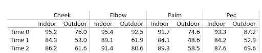
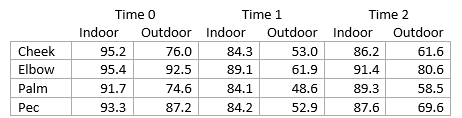
The above table is a depiction of the spreadsheet provided by Dr. Doe. These data are average body temperatures (in degrees Fahrenheit) from six hard-core swimmers measured at four different body parts, in two different swimming locations, across three time points (Time 0 = 1 minute pre-swim, Time 1 = 30 seconds and Time 2 = 5 minutes post-swim). The indoor water temperature was 79°F while the outdoor water temperature was a toasty 52°F.
After going through the data as a class, I asked the students to create a table and a figure that could help Dr. Doe answer his question. But I realized that I would need to give my students some tools so they could do this effectively. What framework could I provide the students to help them design effective tables and figures to answer our client’s question?
This was when the wheels started turning. I realized that the answer boils down to a rephrasing of the questions Nolan and Perrett (2016) urge their students to ask: “What are the important comparisons?” and “How do we emphasize them?” The answers to these questions not only led to the instructional framework outlined below, but also provided a path for creating rubrics to assess the quality of student created tables and graphs.
Identifying the important comparisons
The first step in designing a table or figure is to identify the elemental groupings. What I mean by elemental groupings is comparing a single quantitative value or a small collection of quantitative values across one or more grouping variables. As Stephen Few writes in his excellent book Show Me the Numbers (2012), we “must always begin with a clear sense of what belongs together” (pg. 145). For us, it’s:
- What do we want to compare?
- Answer: The biologist wants to know how the body temperature recovery depends on water temperature for each body part.
- What quantitative data value or values constitute a single instance of “body temperature recovery”?
- Answer: It is the triplet of three data values at Time 0, Time 1, and Time 2. For example, the values (95.2, 84.3, 86.2) constitute a single elemental grouping as together they comprise a single instance of body temperature recovery.
Emphasizing the important comparisons
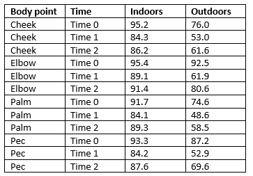
Having identified the elemental groupings, how do we emphasize them? Here we can turn to the Gestalt principles which are fundamental for understanding how humans pre-attentively detect patterns and groups. The primary idea behind the Gestalt principles is that the human brain strives to perceive groupings of individual entities; that is, aggregates rather than parts. The most relevant principles for table and figure design are enclosure, connection, proximity, and similarity. Consider the following:
Each of these four sets of nine geometric objects are, at their essence, just arrangements of nine individual shapes. But we don’t see nine individual shapes. Moving clockwise starting from the top-left, we see two elemental groupings due to the principle of enclosure; the next is three elemental groupings as rows due to the principle of connection; the third is three elemental groupings of columns due to the principle of similarity; and lastly three elemental groupings of columns due to the principle of proximity.
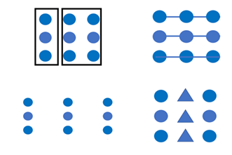
It is important, when designing tables and figures, to keep a hierarchy of these principles in mind. For example, consider this figure:
On the left, we see three rows due to connection before we see three columns induced by similarity. On the right we first see enclosed top and bottom boxes, but within each box we see two rows induced by proximity before we see the columns due to similarity. Note that in the right-hand figure, we could consider each row within the box to be an elemental grouping. Stephen Few (2012) posits the following ranking of these four principles, from strongest to weakest: 1. Enclosure; 2. Connection; 3. Proximity; 4. Similarity.
We can invoke these principles with table and figure design with the tools outlined in the following table.

“Rules” are thin horizontal or vertical lines used to demarcate groupings. I add “canvas space” along with white space to indicate that proximity can be induced by putting space of any kind between elemental groupings, not just necessarily blank (white) space.
So how do we apply these principles to emphasize the important comparisons? We can put elemental groupings close to each other and far from other groupings (proximity). We can make sure that entities within an elemental grouping are similar to and/or connected with each other. We can separate sets of elemental groupings that we want to compare by enclosing them from other sets.
Let’s use Dr. Doe’s example to illustrate these table and figure design principles, starting with tables.
A well-designed table
Within each body part (cheek, elbow, palm, pec), the values within each indoor/outdoor elemental grouping are close to each other and separated from the other by way of white space. Proximity is employed to facilitate comparing an important elemental grouping: the indoor to outdoor grouping. Vertical rules are used to separate the body parts from each other. Here we see the hierarchy of principles: consider the damage to the design if we were to replace the white space between indoor/outdoor groupings with a vertical rule, and the vertical rule between body parts with white space. The viewer would have an entirely different experience!
A poorly-designed table
From a viewer’s perspective, there is no sense of what belongs together, as each data value is enclosed in its own grid cell. Members of each elemental grouping are spread across a wide space, with other unrelated members in between (to compare 95.2, 84.2, and 86.2 we must jump over intervening data points).
What about graphs?
In the following bar chart comparison, the right version of the graph maintains a sense of the groupings that are important. The left version presents an example of how the concept of enclosure can actually hinder our understanding of the appropriate elemental groupings.

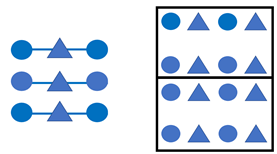
In this example with scatter plots, the left-hand graph uses similarity alone to convey the elemental grouping. On the right, we see how that communication can be further clarified by also introducing connections between the points.

Conclusion
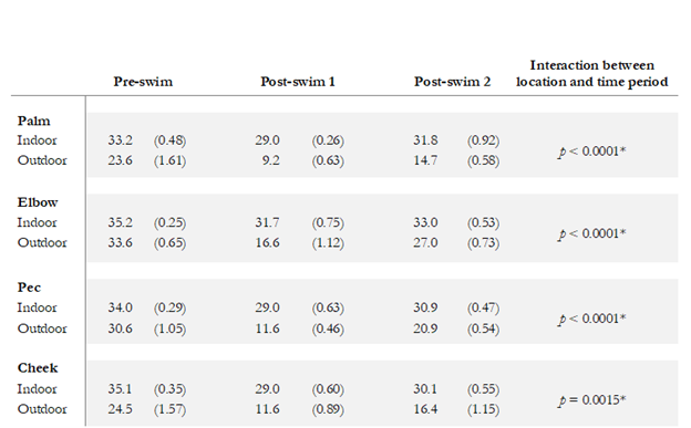
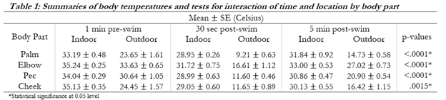
I hope these ideas have been useful, not only as an instructional resource but also for assessments. I often find it difficult to assess the quality of tables and figures that students design. With these principles in mind, it may be clearer to build rubrics that assess whether the elemental groupings are appropriately defined and communicated to the viewer through effective implementation of the Gestalt principles. I conclude with a couple examples of student tables from the actual consulting class designed to communicate these data (the temps are in Celcius, along with standard deviations and p-values testing for interactions, but the point is the same!). Given what we’ve discussed, how would you grade these tables? Can you identify the design elements that are at play to invoke the different principles? Can you determine where the Gestalt principles have been employed effectively, and where they’ve been wielded poorly resulting in greater confusion of what goes together?

Contributing author Silas Bergen is an associate professor of statistics and data science at Winona State University.
References
Stephen Few. 2012. Show Me the Numbers: Designing Tables and Graphs to Enlighten. Analytics Press; Second edition, Burlingame, CA.
Deborah Nolan and James Perrett. 2016. Teaching and learning data visualization: Ideas and assignments. The American Statistician, 70(3):260-269.

Leave a comment