As outlined by Cobb (2007), most introductory statistics books teach classical hypothesis tests as
- formulating null and alternative hypotheses,
- calculating a test statistic from the observed data,
- comparing the test statistic to a reference (null) distribution, and
- deriving a p-value on which a conclusion is based.
This is still true for the first course, even after the 2016 GAISE guidelines were adapted to include normal- and simulation-based methods. Further, most textbooks attempt to carefully talk through the logic of hypothesis testing, perhaps showing a static example of hypothetical samples that go into the reference distribution. Applets, such as StatKey and the Rossman Chance ISI applets, take this a step further, allowing students to gradually create these simulated reference distributions in an effort to build student intuition and understanding. While these are fantastic tools, I have found that many students still struggle to understand what the purpose of a reference distribution is and the overarching logic of testing. To remedy this, I have been using visual inference to introduce statistical testing, where “plots take on the role of test statistics, and human cognition the role of statistical tests” (Buja et al., 2009). In this process, I continually encourage students to apply Sesame Street logic: which one of these is not like the other? By using this alternative approach that focuses on visual displays over numerical summaries, I have been pleased with the improvement in student understanding, so I thought I would share the idea with the community.
Visual inference via the lineup protocol
In visual inference, the lineup protocol (named after “police lineup” for criminal investigations) provides a direct analog for each step of a hypothesis test.
- Competing claims: Similar to a traditional hypothesis test, a visual test begins by clearly stating the competing claims about the model/population parameters.
- Test statistic: A plot displaying the raw data or fitted model (we’ll call it the observed plot) serves as the “test statistic” under the visual inference framework. This plot must be chosen to highlight features of the data that are relevant to the hypotheses in mind. For example, a scatterplot is a natural choice to examine whether or not there is a correlation between two quantitative variables, but will be less useful in the examination of association between a categorical and a quantitative variable. In that situation, side-by-side boxplots or overlaid density plots are more useful.
- Reference (null) distribution: Null plots are generated consistently with the null hypothesis and the set of all null plots constitutes the reference (or null) distribution. To facilitate comparison of the observed plot to the null plots, the observed plot is randomly situated in the field of null plots, just like a suspect is randomly situated amongst decoys in a police lineup. This arrangement of plots is called a lineup.
- Assessing evidence: If the null hypothesis is true, then we expect the observed plot to be indistinguishable from the null plots. If you (the observer) are able to identify the observed plot in the above lineup, then this provides evidence against the null hypothesis. If one wishes to calculate a visual p-value, then lineups need to be presented to a number of independent observers for evaluation. While this is possible, it is not a productive discussion in most intro stats classes that don’t do a deep dive into probability theory.
Example
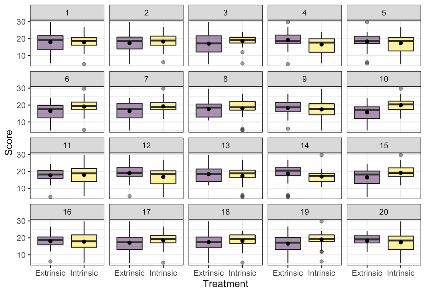
As a first example in class, I use the creative writing experiment discussed in The Statistical Sleuth. The experiment was designed to explore whether creativity scores were impacted by the type of motivation (intrinsic or extrinsic). To evaluate this, creative writers were randomly assigned to a questionnaire where they ranked reasons they write: one questionnaire listed intrinsic motivations and the other listed extrinsic motivations. After completing the questionnaire, all subjects wrote a Haiku about laughter, which was graded for creativity by a panel of poets. Below, I will give a brief overview of each part of the visual lineup activity.
Competing claims
First, have my students discuss what competing claims are being investigated. I encourage them to write these in words before linking them with the mathematical notation they saw in the reading prior to class. The most common answer is: there is no difference in the average creative writing scores for the two groups vs. there is a difference in the average creative writing scores for the two groups. During the debrief, I make sure to link this to notation:


EDA review
Next, I have students discuss what plot types would be most useful to investigate this claim, reinforcing topics from EDA.
Lineup evaluation
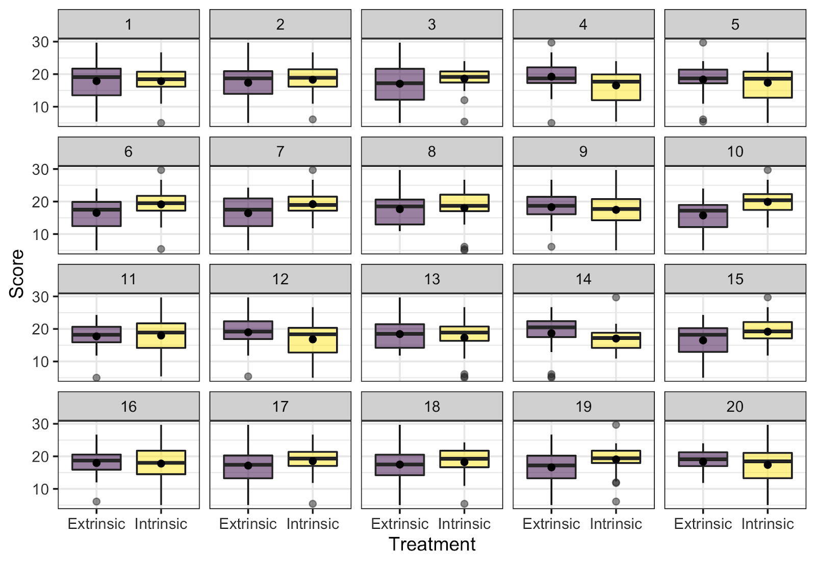
Most students recognize that side-by-side boxplots, faceted histograms, or density plots are reasonable choices to display the relevant aspects of the distribution of creative writing scores for each group. I then give them a lineup of side-by-side boxplots to evaluate (note I place a dot at the sample mean for each group), such as the one shown below. Here, the null plots are generated by permuting the treatment labels; thus, breaking any association present between the treatment and creativity scores. (I don’t give the students these details yet, I just tell them that one plot is the observed data while the other 19 agree with the null hypothesis.) I ask the students to
- choose which plot is the most different from the others, and
- explain why they chose that plot.
[Your turn! Try it out yourself! Which one of these is not like the other?]
Lineup discussion
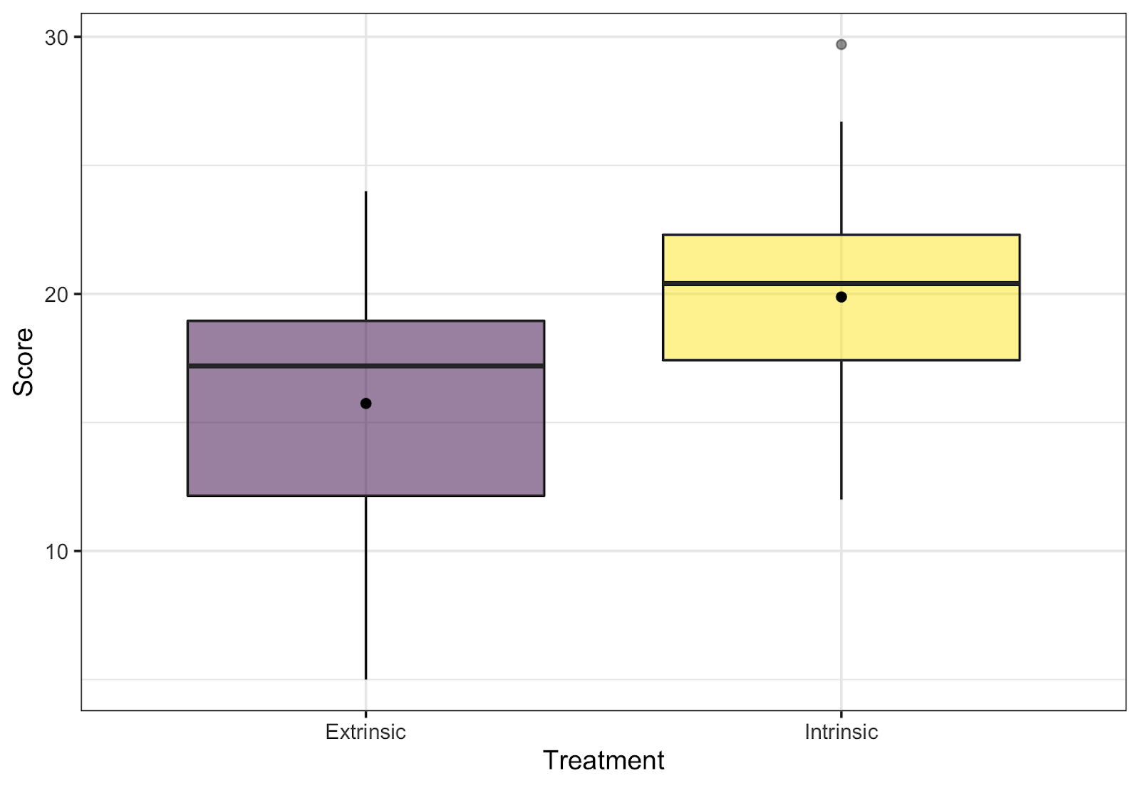
Once all of the groups have evaluated their lineups and discussed their reasoning, we regroup for a class discussion. During this discussion, I reveal that the real data are shown in plot 10, and display these data on a slide so that we can point to particular features of the plot as necessary. After revealing the real data, I have students return to their groups to discuss whether they chose the real data, and whether their choices support either of the competing claims. Once the class regroups and thoughts are shared, I make sure that the class realizes that an identification of the raw data provides evidence against the null hypothesis (though I always hope students will be the ones saying this!).
Biased observers
When I first started this activity, I showed the students the real data prior to the lineup, which made them biased observers. Consequently, students had an easier time choosing the real data, and the initial discussion within their groups wasn’t as rich. However, I have seen little impact on the follow-up discussion focusing on whether the data are identifiably different and what that implies.
Benefits of the lineup protocol
The strong parallels between visual inference and classical hypothesis testing make it a natural way to introduce the idea of statistical significance without getting bogged down in the minutiae/controversy of p-values, or the technical issues of describing a simulation procedure before students understand why that’s important. All of my students understand the question “which one of these is not like the others,” and this common understanding has generated fruitful discussion about the underlying inferential thought process without the need for a slew of definitions. In addition, after this activity I find it easier to discuss how we generate permutation resamples and conduct permutation tests, because students have seen permutations in lineups and have already thought about evaluating evidence.
Where would this fit into your course?
As you’ve seen, I use the lineup protocol in my intro stats course to introduce the logic behind hypothesis tests.
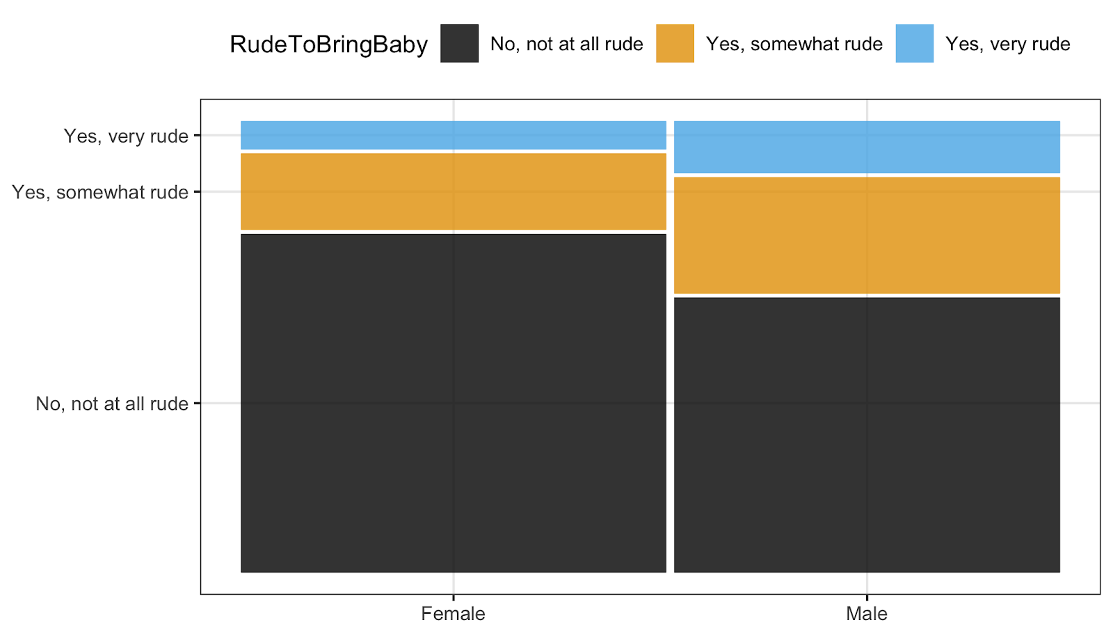
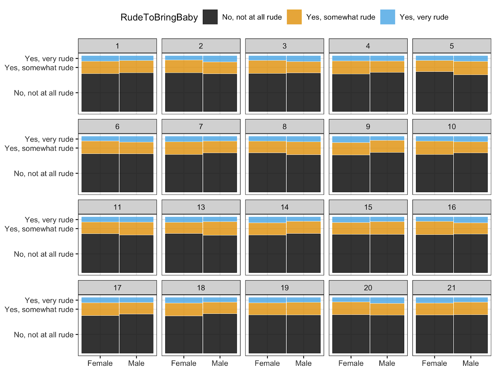
In addition, I use visual inference to help students build intuition about new and unfamiliar plot types, such as Q-Q plots, mosaic plots, and residual plots. For example, when I introduce students to mosaic plots using the flying data set in the fivethirtyeight R package, I pick one pair of categorical variables, such as one’s opinion on whether it’s rude to bring a baby on a plane and their self-identified gender. Then, I have students create the mosaic plot and discuss what they see. Once they have recorded their thoughts, I provide a lineup consisting only of null plots (i.e., no association) and have them compare their observed plot to the null plots, discussing what this tells them about potential association.
How to create lineups for your classes
The nullabor R package makes creating lineups reasonably painless if you understand ggplot2 graphics. I’ve created a nullabor tutorial to help you create lineups for your classes, and am almost done with shiny apps to implement lineups in a variety of settings.

Leave a comment